
Alexandra Academy Trust Brand Creation & Rollout
As you may already know, we work with hundreds of Nurseries, Primary Schools, Secondary Schools, Colleges, Universities and Multi-Academy Trusts across the UK helping them to build and develop their brands across a complete range of medias and platforms.
When Alexandra Academy Trust first collaborated with Education Office, including two of their schools – Haslington Primary Academy and Monks Coppenhall Academy, we had a series of targets and objectives to reach. For the most part, the key objective was to align both Schools with the Trust and ensure their marketing collateral reflected the important values that their Schools hold.
Throughout the design journey with Alexandra Academy Trust, we have uniquely curated two new brands, three new websites, and a wide variety of school signage to display the ethos of the Trust and Schools, through the power of professional design and a highly skilled workforce.
The Trust
Alexandra Academy Trust is a Multi-Academy Trust working passionately to create better futures for the children in their local community. Established in 2016, the Trust believes that every school should be unique and retain this uniqueness, ensuring the core values of the Trust are always maintained at all times.
Since their creation, the Trust now facilitates and coordinates with 3 educational establishments including Monks Coppenhall Academy, Monks Coppenhall Day Nursery, and Haslington Primary Academy.
The Challenge
The initial brief was appointed to us by the Trust expounding an array of projects to accomplish including new branding and signage for both Haslington Primary Academy and Haslington Nursery, promotional photoshoots for both Primary Schools, and three new websites for the Trust, Monks Coppenhall Academy and Haslington Primary Academy.
From early conversations, it was clear that a modern and contemporary design was more appropriate for the schools and in turn, a core component in our design phase for the branding, school signage and new websites.
Results
- New branding – Two completely unique logos were created for Haslington Primary Academy that perfectly reflect the personality of both the Nursery and Academy, offering a new and modern identity for these educational establishments.
- Striking school signage – Aligned perfectly with the new branding, external signage was designed, printed and installed in house by our team.
- Bespoke designed websites – Three contemporary and user friendly websites, constructed specifically for a variety of devices including mobile.
Phase 1 – Branding Anatomy
Phase one first began with the rebranding of both Haslington Primary Academy and Haslington Nursery with the aim of repositioning them both as modern and forward thinking educational institutes.
Our fantastic design team put forth a concerted effort to create a variety of unique logo concepts that met the brief of creating a range of modern and contemporary logos whilst reflecting the fun and passionate ethos of both establishments.
Option 2:
The curvature shape, once again using the colours of the rainbow, signifies the smile of a child, correlating to the strapline.
The end of each of the colours offers the audience the opportunity to see the stepping stones for the children as they move into each school year.
The Serif font used makes a bold statement and ensures that the reader’s eyes focus directly on the name of the school.
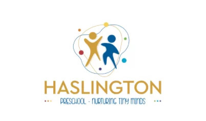
Option 3:
The Serif font used in Option 3 helps increase the spacing between the letters to present a more traditional look and feel to this design.
Paired up with the outline of the Haslington Academy building, Option 3 presents a more established and trustworthy message to the audience.
Again, the colours of the rainbow represent the diversity in the school and partnered with the light blue, makes the strapline more of a key selling point.
Option 4:
Our final logo concept was option 4, utilising a drop shadow on the values of the school to represent the warmth of the teachers when teaching the children in the school.
Using the traditional colours of the rainbow, we also incorporated a golden colour to stamp authority into the design. With connotations of love and wisdom, the gold colour symbolises the achievements raised at the school.
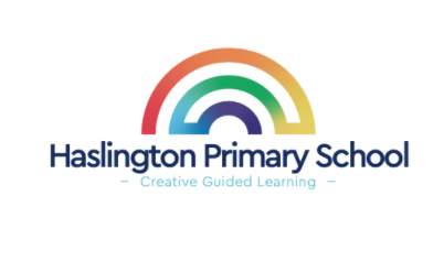
After discussing the various logo options with the team, option 4 was the final chosen logo that fit best with the personality of their school.
Haslington Nursery
Taking inspiration from the new Haslington Primary Academy logo, our design team then approached the rebranding project for the Nursery.
Option 1:
Using a Sans Serif font, Option 1 offers the audience an opportunity to see an insight into the modern nursery.
Using again the colours of the rainbow and strapline of “Fun Learning” showcases the enthusiastic learning environment and the approachable staff present at the school.
Option 2:
Choosing a similar Sans Serif font to Option 1, also means we are able to present a more childlike feel to the design showcasing that the Nursery is focused more towards younger children than older.
The iconography used also showcases the community feel of the Nursery, highlighting that the children are at the centre of everything they do.
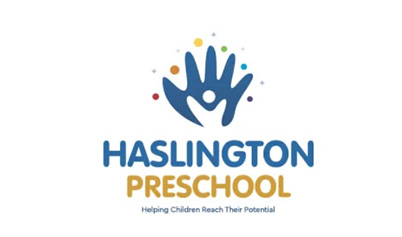
Option 3:
Showcasing both a Serif and Sans Serif font, Option 3 offers a modern, yet more formal representation of the Nursery.
Utilising the icons of children in the centre of the bubble, allows the audience to recognise that this is a fun and safe environment for children.
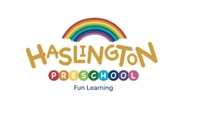
With the input and opinions of the team at Haslington Nursery, they made the final decision that Option 1 was the most appropriate choice for their establishment.
Phase 2 – Standing Out From The Crowd
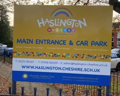
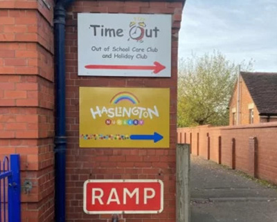
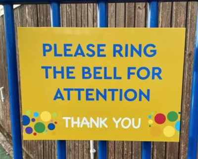
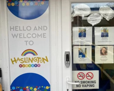
After the new branding had been confirmed, we then moved onto rolling out the branding onto their new signage. Creating a wide variety of signs including:
Phase two included the design, manufacture and installation of their school signage across both Haslington Nursery and Haslington Primary Academy. As always, our process began with an initial site survey with both establishments to measure up. From this point, our enthralled design team created various designs to present to the team at the schools to review and approve. Once all the designs were signed off, our production and signage team worked collaboratively to get these graphics into production and installed efficiently and professionally.
The objectives of these signs were to help guide visitors, staff and parents around the school but also showcase the new branding designed and implemented by Education Office, pitching both the Nursery and Academy as the top establishments for children to attend.
Phase 3 – The Challenge Of Efficiency
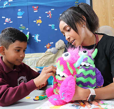
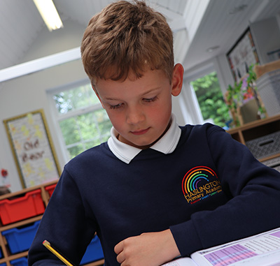
Much like with any school photoshoot that we complete, time is always the most challenging factor. Ensuring that the promotional photos displayed the personality of the Schools, whilst snapping the most principal photos of the children was vital when carrying out these photoshoots.
Throughout Phase 3, we invested a full day’s shoot at both Monks Coppenhall Academy and Haslington Primary Academy to ensure we had plenty of time to capture the real essence of the Schools to project to their target audience.
Take a look at some of the fantastic photos we took on the day…


Phase 4 – Responsive Website Design
Whilst our photography team were capturing some inspiring photos for the new websites, our web development team had been working tirelessly in the background to get all of the new websites live.
Each of the individual websites had their own bespoke website design which represented their school’s core values and typically the most viewed pages from Google Analytics. We worked closely with the team to design and develop their website, engaging with them for any feedback regarding the websites.
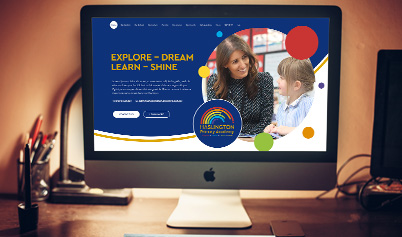
Haslington Primary Academy
Utilising the same colours and fonts featured in their new branding, the design of their website presented a friendly and vibrant learning environment for those attending the Academy.
An important feature for Education Office was to ensure that the key pages on the website were projected from the outset. Through the use of the variety of the colours in the logo, we easily and clearly presented an array of key pages in an aesthetically pleasing manner. Matching this with the new images we had taken, the design seamlessly shows the positive and engaging curriculum at the Academy.
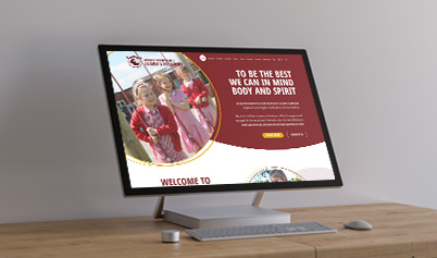
Monks Coppenhall Academy
After carefully curating the design, we incorporated a variety of design elements that positioned monks Coppenhall Academy as a market leading school. One leading factor is the brush stroke borders that draw in the eye of the audience and encourage them to take another moment to review the content in that section.
Compared to the Haslington website, the colours are less vibrant but focus more on the traditional colours in their logo. As an Academy looking to offer safety as their focus point, we maintained this from the outset in the design, with subtle hints including rounded corners on the edges of boxes to offer a more smooth design.
Both of these school website designs offer the opportunity for staff, current parents and prospective parents to easily find information about the schools in the Trust and get in touch with the team directly should they wish to do so.
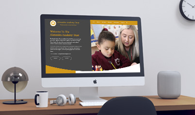
Alexandra Academy Trust
Once again utilising the colours and fonts from their own logo, our team coordinated a new website design that clearly publicises the schools in the Trust and the relevant information most likely to be asked by prospective schools looking to join a multi-academy Trust.
Through the use of Serif fonts and the more traditional grey and gold colour combination, this web design showcases a more commercial look and feel but still demonstrates the passion the Trust has in supporting their schools and the children attending these schools.
Summary
Working on this project with the Trust has enabled us to collaborate closely with their team and ensure that we successfully achieve the design brief each and every time. From Haslington’s initial logo design to the build of the new websites, we have successfully helped Haslington with the start of their brand rollout and also modernise all of the websites across the Trust.
We will continue to work with Alexandra Academy Trust to aid them with the roll out of their new brand and all of the schools within the Trust; and continue to track the success of their new brand through the next phases of their branding.
We are really looking forward to collaborating further with the Trust and supporting the team with any new projects they need our expertise for.